Google would like to remind you that they are a search engine first.
If you look at the Yahoo! home page, you will see what I mean.
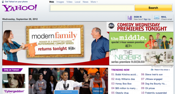
I’m not even sure what Yahoo! is anymore. A search engine? A news and entertainment site? An information curator? Compare the photo above with the front of Google:
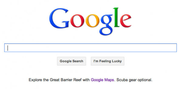
Google remains true to its roots, and it is a search engine first and foremost. Sure, it gives one small interesting link at the bottom (which is awesome, by the way) with secondary links to navigate your Google account services, but the main focus is still on search.
Takeaway lesson: Too much STUFF on a front page is not a good thing. Focus on 1-3 priorities for your business, and have those be the only direction of traffic flow from your front page.
Amazon
Amazon‘s software takes personal customization to a whole new level.
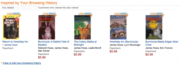
Not only does Amazon’s front page know I am currently reading a Bunnincula book with my daughter, but it also knows what other books we might like in this series once we have finished this one. The software can anticipate future buying trends, suggest relevant new products based on my past purchase history, and give priority to the products that I am most likely to buy. Many people think Amazon built a name for itself as an online bookstore — but really the genius of Amazon lies in the software which combines the capability of worldwide delivery and distribution with the level of personal recommendation that you would get from a close friend.
Takeaway lesson: You may not have the budget for Amazon-level personalization and user tracking, but how can you recreate that on a small scale? Can you get to know your market better to create products and services that really speak to them?
Pamela Slim
Pamela Slim’s site (the personally branded one, not Escape from Cubicle Nation) is really only one page. Yet, in that one page, she manages to capture the essence of what you will get when you work with her (enthusiasm, positive support, clarity and encouragement) AND get you on her list.
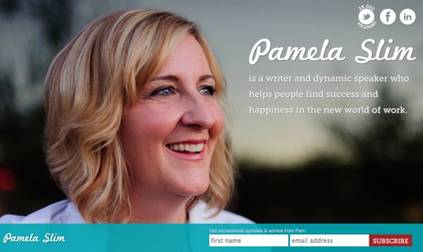
Takeaway lesson: In as few words as possible, what feeling can you give a visitor to your landing page? Can you say more with less?
I Will Teach You To Be Rich
Ramit Sethi’s I Will Teach You To Be Rich really can’t be more clear, from the name of the site to the statement right on the front page.
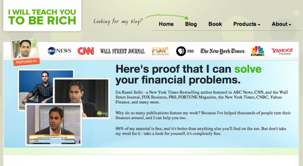
He also makes a point to direct users to his blog — the one place where he gets the most traffic, and the most opportunity to connect with readers (which leads to income potential later) The little arrow on the top of his page may seem casual, but it is also well-designed in terms of it’s placement (right at the top of the page) and in terms of color (green, the color of GO and of money).
Another part of Ramit’s front page that is noteworthy is his popup message. Part humor and part very-well-thought-out strategy, it’s a wonderful little piece of marketing that speaks directly to the target market of I Will Teach You To Be Rich.
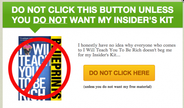
Takeaway lesson: Is your language clear on your landing? Is the direction of the home page focused? Are you directing your readers to the places on your site where they will want to go? Your landing page should be a reflection of your entire marketing strategy, guiding your visitors on a path through your marketing plan.
MailChimp and Campaign Monitor
Oh, did I say 5 landing pages? Well, we’ll just count these two as a tie.
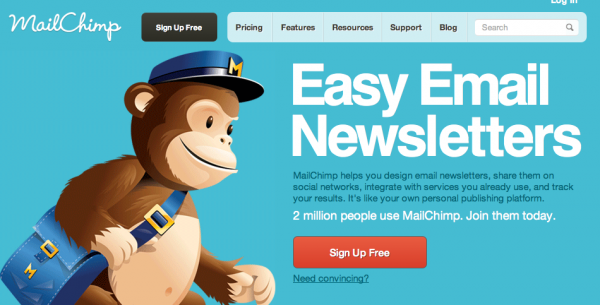
MailChimp and Campaign Monitor both serve the same function — they are a service to help people create and send rich text and HTML e-mail. Where they differ, however, is in their target market. MailChimp, above, is targeted to a more non-technical user. They focus on the ease of use of the software with an element of personality and humor. Campaign Monitor, below, is targeted toward the web design/development professional. Their users don’t feel apprehension about using mailing list software, so MailChimp’s humor and softening techniques aren’t useful here. What Campaign Monitor does speak to, however, is the design aesthetic of making e-mails on the Campaign Monitor service, and how web professionals can resell the Campaign Monitor service to their clients.
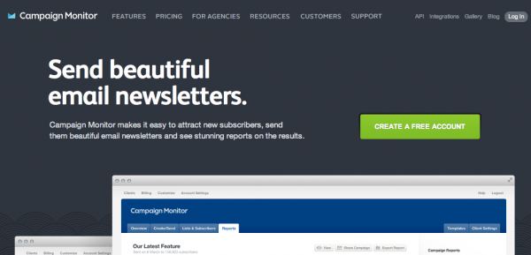
Takeaway lesson: Even when two companies seem like they are providing the same service, they both need their own little niche. What is your own business niche, and does your front page copy speak to it?
How could you use these lessons in your own business?
Please share in the comments below or on the Facebook page!